Billowing and Undulating Text
Screen fonts have been an incredible nuisance since the Macintosh came out in 1984. I believe they have done great harm.
It is not the notion of having pretty-looking text that is bad, but the incredible difficulties of installing and managing fonts on the computer and on the screen.
Having to specify a font *point size* is particularly stupid. The screen user wants fonts to be *the right* size, not a particular number, and the sizes should be adjustable up and down quickly. (When I last looked at Microsoft Word, it supposedly allowed this, but the system would soon crash when enlarged and shrank my fonts. I am told this is because each time I made a font larger or smaller, it would *reload that font into memory*, soon using all space. What good is that to anybody?)
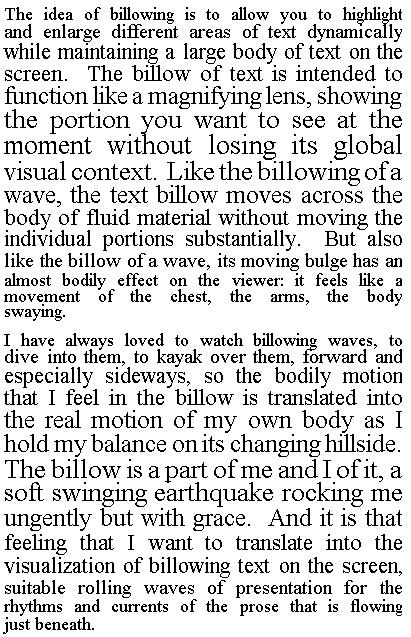
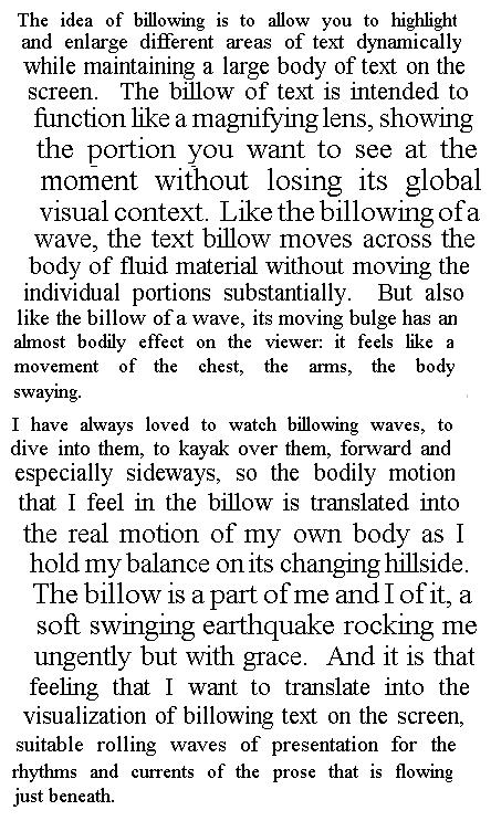
More importantly, it should be possible to vary the size of type dynamically for any purpose. For instance, the notion of locally enlarging and shrinking type to highlight areas of a text, which I believe was among my earliest designs.* I would like to call it *billowing*. This is how it might look:
We also need to get away from rectangular windows. Billowing can be combined with undulating (either 2D or 3D simulation of rippling pennants in the breeze), as follows:
We can also taper the text, for example starting it wide at the top and making it smaller as it goes down. That would be triangular. But we can also undulate it downward, like the tapering typeset on a page of one of Lewis Carroll's *Alice* books. This can be combined with billowing. Unforch I have no time to demonstrate that, but it's obvious.
_______
* Circa 1960 or 1961.